Designing forms
Form is a view which is typically used for entering or editing data that contains several pieces of information. Form contains input fields, access to pickers and other controls. Form types range from filling a couple of text fields to more complex situations, such as creating a calendar event or a contact card with multiple details.
Basic interaction of forms
A form consists of a set of fields defined for the app.
Users can scroll the form and start to fill the fields by tapping on them. Users can choose freely in which order they fill in the form fields. However, you should design the form in a logical order so that it would be easy for the user to start from the top and move forward field by field. The form fields can have predefined content, such as time and date. Typically form fields contain hint texts helping people to type in relevant information, and default values for pickers.
The form should have a toolbar with the command 'Save' or 'Done'.
Pressing back key within a form should cancel creating a new entry or cancell all changes. No confirmation dialog should be displayed when the back key is pressed. By pressing the back key people should go back to the state where they opened the form. Below is an example of using the back key to cancel input in a form.
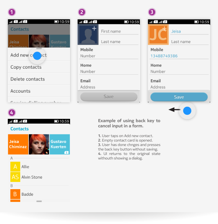
Adding a new entry by using a form is typically started by choosing the 'Add new' function. After successfully saving a new entry, the phone goes to a view where the created entry is visible, giving people a confirmation that they have completed the form successfully. For example, when creating a new calendar note and pressing 'Save' button, the phone displays a view where people can see the new calendar note – either a full screen view showing the new entry, or a summary view where several calendar entries are visible.
Editing an entry is typically started by choosing the 'Edit' function. Opening a form to edit can also be initiated by tapping a field or en entry in viewing state if tapping has no other function. When the form is opened, it is considered as an active editing state. The viewing state should be designed to look different than the editing state, so that it is clear to people whether they are just viewing information or whether they can edit field contents.
Form components
Forms can contain the following field types:
| Field name | Description |
|---|---|
| Text field | Used for entering textual information. See LCDUI Text input and LWUIT Text field for more information. |
| Time field | Used for selecting a time using the time picker. When tapped, opens the picker in full screen mode. After confirming the time, the UI returns to the form. For LCDUI see Date and time fields for more information. For LWUIT, see Pickers for more information. |
| Date field | Used for selecting a date using the date picker. When tapped, opens the picker in full screen mode. After confirming the date, the UI returns to the form. For LCDUI see Date and time fields for more information. For LWUIT, you can either use the Calendar component to set the date, or create a date picker using a tumbler (Spinner), see LWUIT Pickers for more information. |
| Choice picker field | Used for selecting a value using the choice picker. When tapped, opens the choice picker. After selecting the value, control returns to the form. For LCDUI see Single selection (ChoiceGroup tyepe POP-UP) for more information. For LWUIT see Pickers (ComboBox and Choice picker). |
| Multi-choice picker field | Used for selecting a value using multi-choice picker. When tapped, opens the multi-choice picker in full screen mode. After confirming selections, the UI returns to the form. For LCDUI see Multiple selection (ChoiceGroup type MULTIPLE). For LWUIT see Pickers (Multichoice pickers). |
| Switch field | Used for turning on/off a setting. Tapping the switch button changes the value directly. Switch is not supported by either LCDUI or by LWUIT. In LCDUI, you can use CustomItem and implement it as a custom component. For LWUIT, see Switches |
| Check box field | Used for marking something included or excluded. Tapping the check box changes its value directly. In LCDUI you can create a custom check box using CustomItem. For LWUIT, see Switches |
| Multi-value switch field | Used for selecting an active value. The multi-value switch always indicates which setting value is active, and people can tap another value to make it active. Multi-value switches are not supported in LWUIT, but you can use Multiple selection lists to reproduce this behavior. In LCDUI you can use ChoiceGroup of type 'EXCLUSIVE', see Single selection for more information. |
| Image field | Used for selecting an image, for example an avatar. When no image has been set, the image field shows a text or a button guiding people to add an image by tapping. When an image has been selected, the image field displays the image. Tapping the image field uses content picker. In LCDUI you can use the file select API and build an image picker from it. |
In LCDUI, Form elements appear one after the other on the view, and the view becomes scrollable if the content does not fit the screen.
In LWUIT you can use Layout Manager to position fields side by side (for example, you can define the size and then show items in FlowLayout, or you can use BoxXLayout).
The following components can also be used in the form:
| Component | Description |
|---|---|
| Header bar | Header bars are always shown in LCDUI Forms. For more information, see LCDUI Header bar and LWUIT Header and dividers sections. In LWUIT, avoid use of interactive header bar (sticky on top) in forms. |
| Group separator | You can group fields with group separators when it helps people to manage information in the form. For more information, see LWUIT Headers and dividers. Group separators are not supported in LCDUI. |
| Body text | Typically body text is used in a form to show help or error texts related to certain fields. The texts are shown below the field. For more information, see LCDUI StringItem and LWUIT Body text (LWUIT Label). |
| Buttons | Form content area can contain additional buttons for special functionality related to the app or fields. For example, message editor form can have a button next to the recipient field that allows people to open Contacts application for fetching contacts to the field. To implement buttons on LCDUI Forms you can use StringItem of type 'BUTTON'. For more infomation see Buttons. For LWUIT, please refer to the Buttons section of the LWUIT Components. |
Adding and editing new entries using a form
Adding a new entry by using a form is typically started by choosing the "Add new" function. After successfully saving a new entry, the phone goes to a view where the created entry is visible, giving people a confirmation that they have completed the form successfully. For example, when creating a new calendar note and pressing the "Save" button, the phone displays a view where people can see the new calendar note - either a full screen view showing the new entry, or a summary view where several calendar entries are visible.
Editing an entry is typically started by choosing the "Edit" function. Opening a form to edit can also be initiated by tapping a field or an entry in viewing state if tapping has no other function. When the form is opened, it is considered as an active editing state. The viewing state should be designed to look different than the editing state, so that it is clear to the users whether they are just viewing information or whether they can edit field content.
Field labels
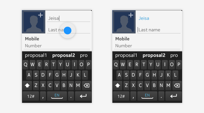
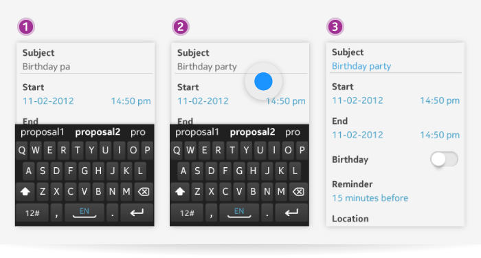
Field labels are titles for the fields informing people about what field is in question. Labels in the form are secondary information, and the content people have added by themselves is presented as primary information. Below is an example of activating a field with a label.
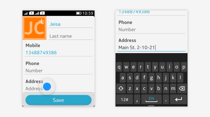
Labels are optional for text, date, time, and image fields. With these fields the placeholder text or image can inform people about the type and usage of the field, and no label is needed.
Two or more fields can also use one common label. For example, in Calendar the start date and start time fields can use one 'Start' label.
When a field that has a label is activated, the label remains visible in the view. When using text fields, if user enters several lines of text, the label can be pushed outside of the view.
Adding fields
The app form can contain the possibility to add more fields. For example, a contact card form can contain only a basic set of fields initially, but users can choose to add more contact details to the form.
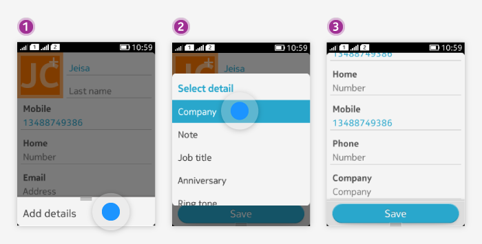
The adding option is typically provided in the option menu in the form. It's also possible that there is a field within the form that controls the visibility of other fields. Changing the value of the field can enable or disable other fields, or alternatively add or remove fields. For example, the 'All day' option in a Calendar note form can disable the start and end time and date fields when turned on.
Errors in fields
In some cases, it is possible that incorrect data has been entered into a field. This can be detected while people are entering content, or after people have chosen some action.
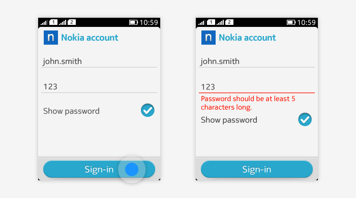
There are two ways to draw attention to errors:
- Error text under the field.
- Error highlight on the field. In case the error is detected after an action has been chosen, for example trying to sign in with an incorrect password, both methods mentioned above are used.
In case the error is detected after an action has been chosen, for example, trying to sign in with an incorrect password, both methods mentioned above are used.
The field containing the error should stay inactive. For example, on-screen keyboard is not invoked because people might miss the error text. The user can choose to enter the correct value by tapping the field or dismiss the form completely.
In case the error is detected while people are entering something, the error highlight appears on the active field. For example, a web service can detect validity of a new user name while it is being typed in. For more information on errors please refer to Error handling.
Modifying the functionality of the text fields to support moving between the fields and completing the form is not supported neither in LCDUI nor in LWUIT (this means, for example, removing the linefeed button of the on-screen keyboard in fields that do not support line feeds and replacing it with a highlighted button that either jumps to the next text field or closes the on-screen keyboard).
When on-screen keyboard is open (text field is active), the drag gesture applied outside of the on-screen keyboard scrolls the form contents. The on-screen keyboard is kept open even after the user releases the drag gesture and the text field stays active. If the user has panned the form so that the currently active field is no longer visible on the screen, it is brought back to the display when the user continues to type in.
The effect of tapping outside of the on-screen keyboard depends on what is tapped.
If the user taps an empty area or an area that has no tap functionality, the active field becomes inactive and the on-screen keyboard is closed.
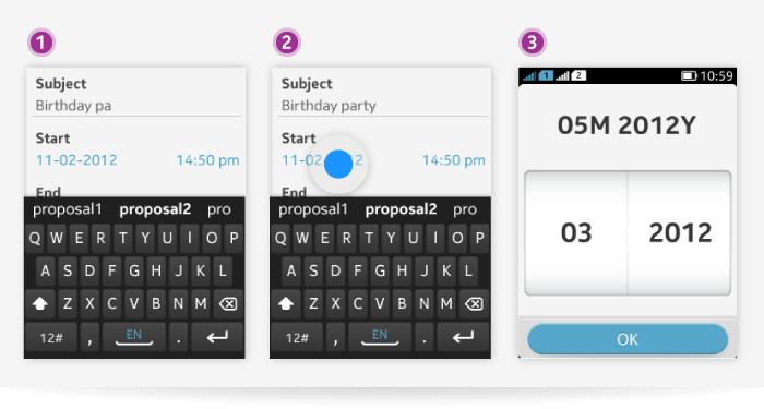
If the user taps on a field that, for example, opens a picker, a picker in full screen mode is directly displayed and the focus moves to another field.
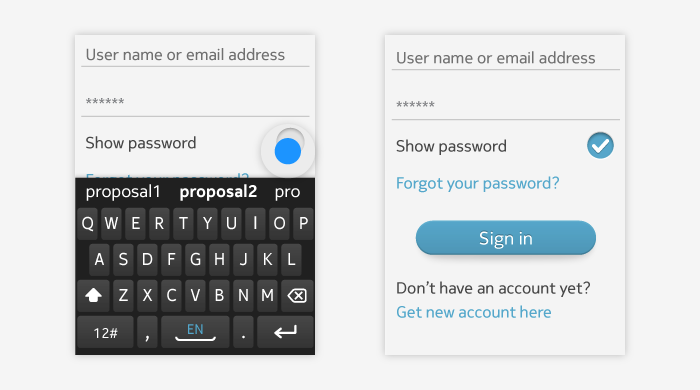
If the user taps on a switch or a check box field, its value is changed directly and the on-screen keyboard is closed (and text field is no longer active).
If the user taps on another text field, the text field is activated, and the form moves the activated field to the top and the on-screen keyboard is kept open.
